R LDA package updated to version 1.2 and an ideal-point model for political blogs

I’ve been on a bit of a R tear lately. Today you should see a new version of the R lda package. This version has lots of fixes including a working mmsb demo with the latest version of ggplot2, corrected RTM code, improved likelihood reporting, better documentation, and much more. Grab it from CRAN today! Special thanks to the following people for bug reports/feature requests (sorry if I forgot anyone):

  • Edo Airoldi
  • Jordan Boyd-Graber
  • Khalid El-Arini
  • Roger Levy
  • Solomon Messing
  • Joerg Reichardt

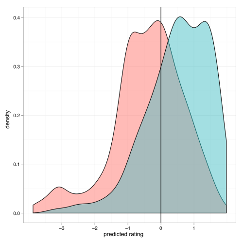
One of the new features is a method to make sLDA predictions on response variables conditioned on documents. In the demo accompanying the package, I fit an sLDA model to a corpus of political blogs tagged as being either liberal or conservative. With this fitted model, I can now use the new predict method to predict the political bent of each of the blogs within a continuous space. The density plot of these predictions is given below, broken down by the the original conservative/liberal label (color of shading).

I like how there’s some bimodality for each contingency — a moderate group and a more extreme group. The model also predicts a heavy tail of super-conservative blogs. There is a real notable bump down by -3. I dunno if this represents reality; it’s probably worthwhile to do more extensive model checking.

Advertisement

3 Comments

Filed under Uncategorized

jjplot: Yet another plotting library for R

Those of you who follow this blog know that making (somewhat) pretty plots is an abiding interest of mine. Many of the plots I’ve made in the past were done using the great ggplot2 package. But recently Eytan Bakshy and I have been tinkering with our own plotting library, jjplot, as a playground for various ideas we’ve had. As the name indicates, it is heavily inspired by hadley’s library. Our library doesn’t do quite as much as ggplot2, and ours is liable to be much buggier. But it’s still fun to play with. Here are some examples of what jjplot can do:

  • Bar plots with fills controlled by the values.

    df <- data.frame(x = 1:50, y = rnorm(50))
    jjplot(x, y, data = df, fill = y, jjplot.bar(col = "black"))

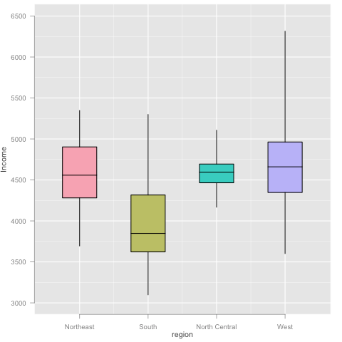
  • Boxplots.

    df <- data.frame(state = rownames(state.x77), region = state.region, state.x77)
    jjplot(region, Income, data = df, fill = region, jjplot.group(jjplot.quantile(), by = region), jjplot.box())

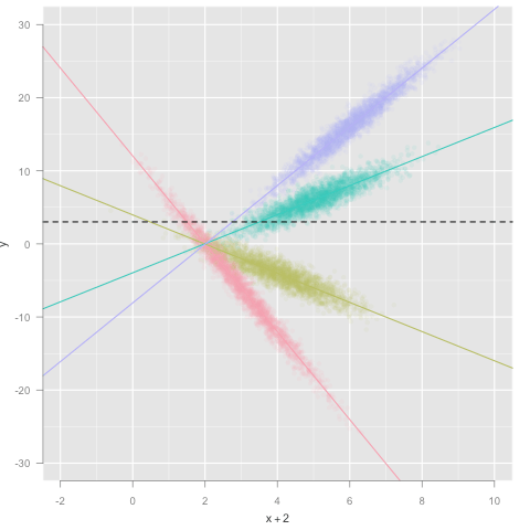
  • Scatter plot, colored by factor, with alpha blending. This also demonstrates how statistics can be used to visualize different aspects of the data simultaneously.

    df <- data.frame(x = rnorm(10000) + (1:4) * 1, f = factor(c('A', 'B', 'C', 'D')))
    df$y <- c(-6, -2, 2, 4) * df$x + rnorm(10000)
    jjplot(x + 2, y, data = df, alpha = 0.10, color = f, jjplot.point(), jjplot.group(jjplot.fit(), by = f), jjplot.abline(), jjplot.fun.y(mean), jjplot.hline(lty = "dashed"))

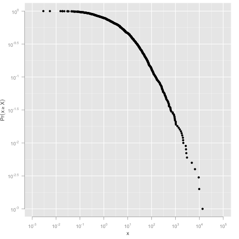
  • An example of log scales and the CCDF statistic.

    df <- data.frame(x=rlnorm(1000,2,2.5))
    jjplot(x, data = df, jjplot.ccdf(density=TRUE), jjplot.point(), log='xy')

Lots more demos and documentation are here. To install visit http://jjplot.googlecode.com/files/jjplot_1.0.tar.gz and install the downloaded package using

R CMD INSTALL jjplot_1.0.tar.gz

We’re eager to hear your feedback!

6 Comments

Filed under Uncategorized

Axl Rose by any other name…

In a post a while ago, I wondered how much info about the band one could glean just by looking at the name. I mean, shouldn’t it be obvious that a band named “Trauma” should be heavy metal?

This was the genesis of a collaboration between me and Matt Hoffman. We wanted to see if you could improve genre prediction using the names of the bands. Unfortunately, neither of us had enough time to really get this project going, but I thought I’d share what results we did get in hopes that someone else will pick up the torch.

To start off, we need a large training set of band/genre mappings. We opted for the DBPedia Infobox mine that you can find at infochimps. (For those who don’t know, they’ve done some awesome data mining to grab all the structured info from Wikipedia infoboxes). I did some cleaning up and have put up the list of artists and genres (the artist in each line of the first file is associated with the genres on the corresponding line of the second file).

You might have noticed that Wikipedia is pretty crazy when it comes to genre definitions (because god forbid we confuse Melodic Death Metal and Power Metal). This craziness makes it hard to map the artists to any canonicalized genre set (such as CAL-500). I tried a bunch of techniques to do this canonicalization (including doing my own crawl of Wikipedia with all sorts of heuristics). None of it worked very well for mapping genres to a canonicalized set, but it did let me make a really cool graph of connections between genres. Eventually, we came to the conclusion that we needed human judgments. We got mechanical turkers to label Wikipedia genres with CAL-500 genres. Those results are here.

With that training set in place, I decided to explore the data to see if there truly were correlations between substrings of artist names and genres. The plot below shows the prevalence in each genre of artists containing “death” (red) or “boyz” (blue) in their name. The green dots show the overall distribution of genres among artists in Wikipedia.

The graph shows that bands containing “death” in their name are much more likely to be Rock, Alternative, Metal/Hard Rock, or Alternative. Conversely, they are less likely to be Jazz, Hip-Hop, or Soul. In contrast, bands containing “boyz” in their name are overwhelmingly Hip-Hop. This confirmed my intuition and seemed promising to me, so we went ahead and developed a classifier for the CAL-500 data set. The techniques we tried were:

  • names (corrLDA)– the correlated topic model fit to the Wikipedia data. Predictions use only names.
  • names (NB) – naive Bayes fit to the Wikipedia data. Predictions use only names.
  • names (LR) – logistic regression fit to the Wikipedia data. Predictions use only names.
  • baseline – Predictions use the baseline frequency of genres on Wikipedia. Predictions do not use any information about the instances.
  • svm – SVM fit using MFCC features. Predictions use both names and audio.
  • svm + names (corrLDA) – SVM fit using MFCC features plus the results of names (corrLDA). Predictions use both names and audio.
  • svm + names (NB)– SVM fit using MFCC features plus the results of names (NB). Predictions use both names and audio.
  • svm + names (LR)– SVM fit using MFCC features plus the results of names (LR). Predictions use both names and audio.

The plot below shows the precision-recall for each of these techniques. As you can see, it’s not very promising. The SVM will outclass any technique which uses the name along; otherwise all of the name techniques look about the same. It looks like we might get a small bump by combining SVM with names (LR) but it’s hard to tell.

But precision-recall may not be the right metric. After all, pop and rock are so frequent that you will probably predict pop for every single item in the test set before you even make any other prediction. Something which is perhaps more meaningful is to look at the rank of the correct labels on a per-test-instance level; the lower the rank, the better the model is at making predictions. Boxplots of the ranks are given below.

We see slightly different patterns when we look at the ranks. Without using any audio data, the naive Bayes technique performs best and manages to get a non-trivial bump beyond the baseline. When audio is included, the names add something, but not much. Interestingly, the names (LR) technique which looked like it might help us at precision-recall actually does a bit worse when you look at the rank. On the other hand, SVM + names (corrLDA) has the same median as SVM, but manages to do a better job at some of the difficult-to-predict cases, leading to a smaller interquartile range.

In sum, names give us something — unfortunately, it’s not a whole lot.

5 Comments

Filed under Uncategorized

The cost of a sample

I once heard it on good authority that Gelman says you usually don’t need more than 12 samples. Well, as a result of a discussion with Sam Gershman (sorry Sam for not answering the actual question you asked!), I wondered if that was true; that is, if under reasonable assumptions it might be better to take a small number of samples. Caveat: there’s probably lots of work on this already, but where would the fun be in that?

Ok, let’s assume that your goal is to estimate \mathbb{E}_{z \sim p(z | x)}[f(z)], where p(z | x) represents some distribution on hidden variables over which you are trying to compute a function, f. For the usual reasons, it’s intractable to compute this exactly, so you’re going to use a sampler. Let’s assume

  • that your sampler has mixed and that you’re getting independent samples (that condition alone should give you fair warning that what I’m about to say is of little practical value);
  • f is bounded (say between 0 and 1);
  • to obtain n samples from the sampler costs some amount, say R(n).

More samples are usually better, because they’ll give you a better representation of the true distribution, i.e. \mathbb{E}_{z \sim \hat{p_n}(z | x)}[f(z)] \rightarrow \mathbb{E}_{z \sim p(z | x)}[f(z)], where \hat{p_n} is the distribution obtained by using n samples. Unfortunately, more samples come at a cost here, so you don’t want too many. How should you tradeoff then?

We can define a loss by \ell = R(n) + |\mathbb{E}_{z \sim \hat{p_n}(z | x)}[f(z)] - \mathbb{E}_{z \sim p(z | x)}[f(z)]|, that is, how far off our sampled estimate is from the truth, plus the cost of obtaining those samples. Using Hoeffding, we can bound the loss \ell < R(n) + \epsilon with probability 1 - 2 \exp( -2 n \epsilon^2). This expression gives you something to think about when you're trying to decide how many samples to take — more samples loosen the bound but increase its probability.

If your cost is linear, R(n) = a n, you might want to choose
something like n = \frac{\epsilon}{a}, which gives you a loss of \ell < 2 \epsilon with probability 1 - 2 \exp(-2 \epsilon^3 / a).

The plot below shows what might happen if you make such a choice. Here, I've let the posterior be an equiprobable binomial distribution. The function I'm computing is the identity f(z) = z. The curves show the loss, \ell for various choices of the cost parameter a as a function of the number of samples. The dots show the chosen values of n for each value of a; the horizontal lines show the 80% loss bound for these choices.

Turns out for some reasonable values, you really should stick to about 12 samples.

3 Comments

Filed under Uncategorized

How diverse is Facebook?

I’ve been doing some work on the topic, along with Lars, Cameron, and Itamar. Read more at http://www.facebook.com/note.php?note_id=205925658858

Leave a comment

Filed under Uncategorized