Monthly Archives: March 2010

Using jjplot to explore tipping behavior

In this post, I’ll show off some recent changes to jjplot that we think are really cool. To help motivate these changes, I’ll walk through them using the tips dataset included with the reshape package.

  • Improved faceting along multiple dimensions. This shows a scatter plot of how much males and females tip on each day of the week, along with a best-fit lines. The black, dashed line shows the best-fit across all data points. Points/lines are otherwise colored by day. I’ll leave it to you to guess why the slope is higher for men on Saturday, but lower on Sunday.

    jjplot(tip ~ (abline() : group(fit(), by = day: sex) +
    point(alpha = 0.5)) : color(day) +
    abline(lty = "dashed") : fit() + total_bill,
    data = tips,
    facet.y = day, facet.x = sex)

  • New stats/geoms such as area/density. Here we’ll make a density plot of the tip fraction, that is, the tip amount over the total bill. The black density shows the overall density, while each each overlaid density shows the density just for points in that panel.

    jjplot(~ area() : group(density(), by = day:sex) : color(day, alpha = 0.5) +
    area() : group(density(), by = day) +
    I(tip / total_bill),
    data = tips,
    facet.y = day, facet.x = sex,
    xlab = "tip fraction",
    ylab = "")

  • Custom geoms/stats. We want to make it easier for the community to augment the system. Right now, the syntax is still sort of opaque and we’re working on it, but you can already get a custom stat just be naming your function jjplot.stat.*. For example, below we define a new kmeans stat. We then cluster the points and draw a best-fit line for each cluster.

    jjplot.stat.kmeans <- function(state, K, use.y = FALSE) {
    if (use.y) {
    km <- kmeans(cbind(state$data$x, state$data$y), K)
    } else {
    km <- kmeans(state$data$x, K)
    }
    state$data$cluster <- factor(km$cluster)
    state
    }
    jjplot(tip ~ point() +
    abline() : group(fit(), cluster) : kmeans(3) +
    total_bill,
    data = tips)
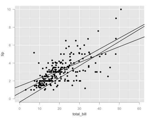
  • Coloring on derived statistics. You may have noticed in the earlier examples that the color syntax has changed. We figured color should be kind of like sort — it’s a pseudo-statistic which can be inserted anywhere in a statistics stack. This means that it becomes easy to color based off of derived statistics. In this example, we make the previous plot much more useful by coloring the fits and points according to the assigned cluster.

    jjplot(tip ~ (point() +
    abline() : group(fit(), cluster)) : color(cluster) : kmeans(3) +
    total_bill,
    data = tips)

Let us know what you think! P.S. A release on CRAN is coming very soon…

Advertisement

14 Comments

Filed under Uncategorized

ePluribus: Ethnicity on Social Networks

is the name of the paper I wrote with Lars, Itamar, and Cameron. It will appear at this year’s ICWSM. You may commence bating those breaths.

14 Comments

Filed under Uncategorized

A few jjplot updates

Eytan and I have been actively exploring lots of crazy new ideas in jjplot, a new plotting library for R. Here’s a quick rundown of recent changes. We’d love to hear what you guys think

  1. Formulae. The old way of expressing the series of geoms and stats that form the plot was cumbersome. Putting a series of commands in the … leads to annoying issues such as poorer error handling. More importantly, because it can only express a series of statements, it becomes unclear which stats affect which geoms, making it impossible to express more complicated combinations.

    We believe that formulae are a good solution to this. Layers are separated by ‘+’ operations. Interactions between stats and geoms are expressed via the interaction operator ‘:’. This allows us to gracefully express arbitrary trees of stats and geoms. An example of a jittered scatter plot:

    Old:

    jjplot(x = x, y = y, data = data,
    jjplot.jitter(xfactor=1),
    jjplot.point())

    New:

    jjplot(y ~ point() : jitter(xfactor = 1) + x, data = data)

    The leftmost and rightmost terms correspond to the y and x aesthetics. For a simple case such as this, formulae might not seem like much of an improvement. But consider a more complex example:

    jjplot( ~ line(lty="dashed", col = "red") : hist() +
    bar(width = 0.1) : hist() : jitter(xfactor = 1) +
    Sepal.Length, data = iris)


    Reading from the right, this says to take iris$Sepal.Length, jitter it, bin the data, and bar plot the result. This is cool because it’s immediately clear that you’re stacking stats, plotting a histogram of the jittered data. The first term does the same thing, except that it does a hist() statistic without the jitter, and draws this as a red line.

    By using parentheses, you can also apply a stat to multiple stats/geoms.

    jjplot( ~ (point(col = "blue", size=3) +
    line(col = "red", lty="dashed") +
    bar(width=0.25)) : hist() +
    Petal.Length, data = iris)

    Here we’re just plotting a histogram but with some extra geoms on top for some extra flair.

    We think this notation is a simple and elegant way of expressing what interacts with what.

  2. Facets This way of thinking about facets is somewhat controversial among us. Normally, facets conflate two concepts: how you compute statistics and how you plot them. This means that you compute statistics on facet subsets, then you plot each subset in a separate panel. Well, currently jjplot takes a different tack, treating facets as merely a command to plot different subsets of the data in different panels. To see what this implies, consider

    df <- data.frame(state = rownames(state.x77),
    region = state.region,
    state.x77)
    jjplot(Murder ~ abline(lty = "dashed") : fit() +
    abline() : group(fit(), by = region) +
    point() + Income,
    data = df, color = region, facet = region)


    The first two terms simply do a scatter plot. The next line does lm fits on each subset. Note that you have to be explicit with the grouping. With old semantics, you’d have an implicit group by on the facet variable, but because we aren’t combining the grouping and the faceting anymore, you have to spell it out. The first line shows you the effect of leaving out the grouping operator: you get a fit over all the data that appears on all panels. This is something I’ve always wanted to do and it seems to also be persistent question on stack overflow (e.g., “how do I draw a line at the facet/global mean on each facet panel?”). Hopefully this formulation makes it obvious.

  3. Sorting Another persistent question is how to perform sorting on factor scales. Because of the ease of stacking stats in the formula formulation, we think it makes sense to add a few special stats/geoms. One of them is the sort stat. This performs an identity operation on the data frame but also appends some metadata about how to order things which is then intercepted when the scales are created. Here are some usage examples:

    df <- data.frame(name = factor(letters),
    value = rnorm(26 * 6),
    type = rep(factor(month.name[1:6]), each = 26))
    jjplot(name ~ point() + value,
    data = df, color = type, facet = type)

    The first plot is the data unsorted.


    jjplot(name ~ point() : sort(y = value) + value,
    data = df, color = type, facet = type)

    The second plot sorts according to the mean value associated with each factor across all facets (remember no grouping!). Like relevel, the sort statistic can take a function argument to specify how multiple points should be sorted.


    jjplot(name ~ point() : group(sort(y = value), by=type) + value,
    data = df, color = type, facet = type)

    The last plot wraps the sort in a group by, meaning that each facet panel has its own sorting order.

All of this awesomeness is available in the current svn repo. Check it out!

3 Comments

Filed under Uncategorized

R LDA package updated to version 1.2 and an ideal-point model for political blogs

I’ve been on a bit of a R tear lately. Today you should see a new version of the R lda package. This version has lots of fixes including a working mmsb demo with the latest version of ggplot2, corrected RTM code, improved likelihood reporting, better documentation, and much more. Grab it from CRAN today! Special thanks to the following people for bug reports/feature requests (sorry if I forgot anyone):

  • Edo Airoldi
  • Jordan Boyd-Graber
  • Khalid El-Arini
  • Roger Levy
  • Solomon Messing
  • Joerg Reichardt

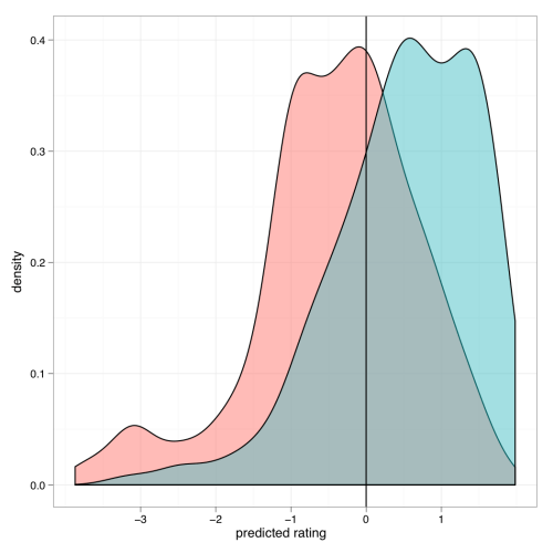
One of the new features is a method to make sLDA predictions on response variables conditioned on documents. In the demo accompanying the package, I fit an sLDA model to a corpus of political blogs tagged as being either liberal or conservative. With this fitted model, I can now use the new predict method to predict the political bent of each of the blogs within a continuous space. The density plot of these predictions is given below, broken down by the the original conservative/liberal label (color of shading).

I like how there’s some bimodality for each contingency — a moderate group and a more extreme group. The model also predicts a heavy tail of super-conservative blogs. There is a real notable bump down by -3. I dunno if this represents reality; it’s probably worthwhile to do more extensive model checking.

3 Comments

Filed under Uncategorized

jjplot: Yet another plotting library for R

Those of you who follow this blog know that making (somewhat) pretty plots is an abiding interest of mine. Many of the plots I’ve made in the past were done using the great ggplot2 package. But recently Eytan Bakshy and I have been tinkering with our own plotting library, jjplot, as a playground for various ideas we’ve had. As the name indicates, it is heavily inspired by hadley’s library. Our library doesn’t do quite as much as ggplot2, and ours is liable to be much buggier. But it’s still fun to play with. Here are some examples of what jjplot can do:

  • Bar plots with fills controlled by the values.

    df <- data.frame(x = 1:50, y = rnorm(50))
    jjplot(x, y, data = df, fill = y, jjplot.bar(col = "black"))

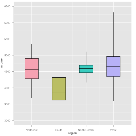
  • Boxplots.

    df <- data.frame(state = rownames(state.x77), region = state.region, state.x77)
    jjplot(region, Income, data = df, fill = region, jjplot.group(jjplot.quantile(), by = region), jjplot.box())

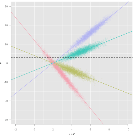
  • Scatter plot, colored by factor, with alpha blending. This also demonstrates how statistics can be used to visualize different aspects of the data simultaneously.

    df <- data.frame(x = rnorm(10000) + (1:4) * 1, f = factor(c('A', 'B', 'C', 'D')))
    df$y <- c(-6, -2, 2, 4) * df$x + rnorm(10000)
    jjplot(x + 2, y, data = df, alpha = 0.10, color = f, jjplot.point(), jjplot.group(jjplot.fit(), by = f), jjplot.abline(), jjplot.fun.y(mean), jjplot.hline(lty = "dashed"))

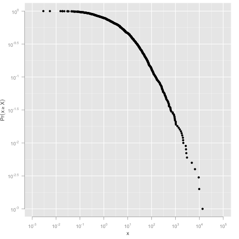
  • An example of log scales and the CCDF statistic.

    df <- data.frame(x=rlnorm(1000,2,2.5))
    jjplot(x, data = df, jjplot.ccdf(density=TRUE), jjplot.point(), log='xy')

Lots more demos and documentation are here. To install visit http://jjplot.googlecode.com/files/jjplot_1.0.tar.gz and install the downloaded package using

R CMD INSTALL jjplot_1.0.tar.gz

We’re eager to hear your feedback!

6 Comments

Filed under Uncategorized