Those of you who follow this blog know that making (somewhat) pretty plots is an abiding interest of mine. Many of the plots I’ve made in the past were done using the great ggplot2 package. But recently Eytan Bakshy and I have been tinkering with our own plotting library, jjplot, as a playground for various ideas we’ve had. As the name indicates, it is heavily inspired by hadley’s library. Our library doesn’t do quite as much as ggplot2, and ours is liable to be much buggier. But it’s still fun to play with. Here are some examples of what jjplot can do:
- Bar plots with fills controlled by the values.
df <- data.frame(x = 1:50, y = rnorm(50))

jjplot(x, y, data = df, fill = y, jjplot.bar(col = "black"))

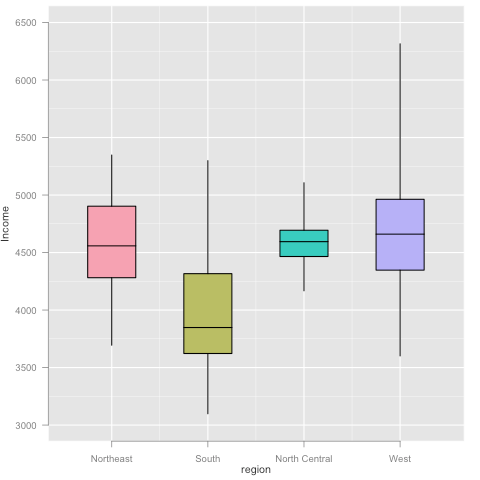
- Boxplots.
df <- data.frame(state = rownames(state.x77), region = state.region, state.x77)

jjplot(region, Income, data = df, fill = region, jjplot.group(jjplot.quantile(), by = region), jjplot.box())

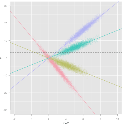
- Scatter plot, colored by factor, with alpha blending. This also demonstrates how statistics can be used to visualize different aspects of the data simultaneously.
df <- data.frame(x = rnorm(10000) + (1:4) * 1, f = factor(c('A', 'B', 'C', 'D')))

df$y <- c(-6, -2, 2, 4) * df$x + rnorm(10000)

jjplot(x + 2, y, data = df, alpha = 0.10, color = f, jjplot.point(), jjplot.group(jjplot.fit(), by = f), jjplot.abline(), jjplot.fun.y(mean), jjplot.hline(lty = "dashed"))

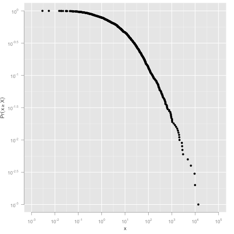
- An example of log scales and the CCDF statistic.
df <- data.frame(x=rlnorm(1000,2,2.5))

jjplot(x, data = df, jjplot.ccdf(density=TRUE), jjplot.point(), log='xy')

Lots more demos and documentation are here. To install visit http://jjplot.googlecode.com/files/jjplot_1.0.tar.gz and install the downloaded package using
R CMD INSTALL jjplot_1.0.tar.gz
We’re eager to hear your feedback!
